The project team recommended overhead directional signs to complement the existing ground-mounted signs. The proposed color scheme coordinated with ORF’s “airport in a garden” setting, and larger typography helps motorists identify destinations and make decisions faster. Adding lighting to signs at critical decision points would enable the system to work just as well at night, and existing ground signs could be refinished to match the new overhead signs. Along with new roadway signage, we suggested revising street names throughout the airport and distinguishing between the north and south curbsides. Both efforts would help motorists navigate the site, especially when using GPS navigation on digital devices.

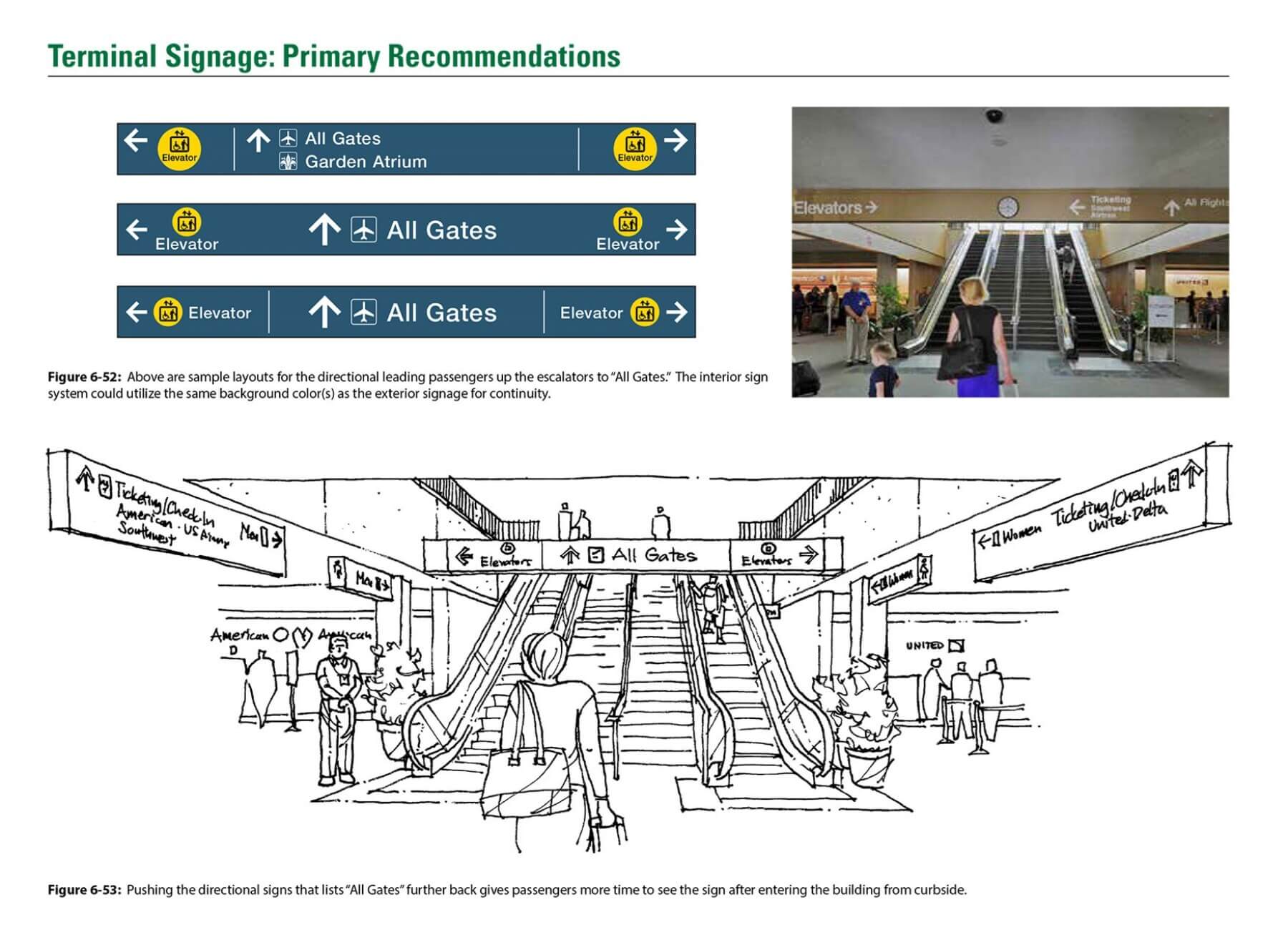
For interior signage, we recommended a new color scheme and finish to complement the exterior signage, reduce glare from reflected sunlight and make the signs easier to read. Realizing the elevators in the departures terminal could be difficult to locate, we proposed locations for new illuminated signs outfitted with a distinctive color and shape combination. Standardizing airport-wide nomenclature, symbols and arrow placement also better connected interior and exterior spaces and instilled greater confidence among travelers.
